Introduction
Many new tab pages are designed more like a search box or a wallpaper page, with maybe a few quick links added occasionally. I initially found them quite clean, but once I actually get into work mode and tabs start piling up, that row at the top of the browser gets longer and longer, making tabs feel increasingly difficult to manage. You know you have a lot of things open, but it's actually hard to tell at a glance what you're currently working on, which are just entry pages, which are for later reading, and which are actually duplicates.
So recently, I made my own Chrome new tab page extension called Tab Harbor.
Its concept is actually quite simple. It's not about making the new tab page flashy, nor is it about creating an "efficiency system." It's about making the new tab page a place where you can actually continue working.
The project is here:
Main Features
Here are the features I use most often now and find most valuable.
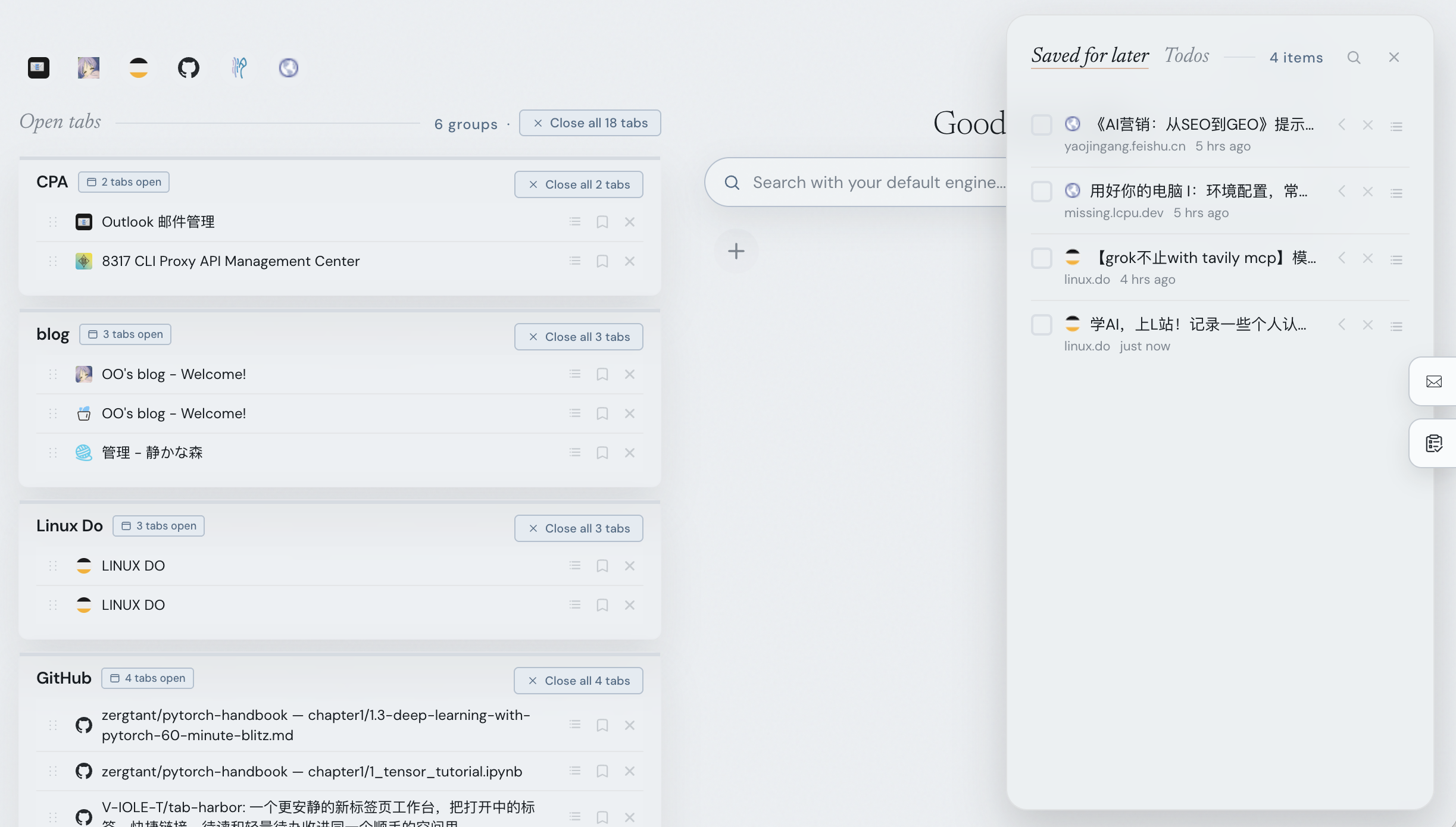
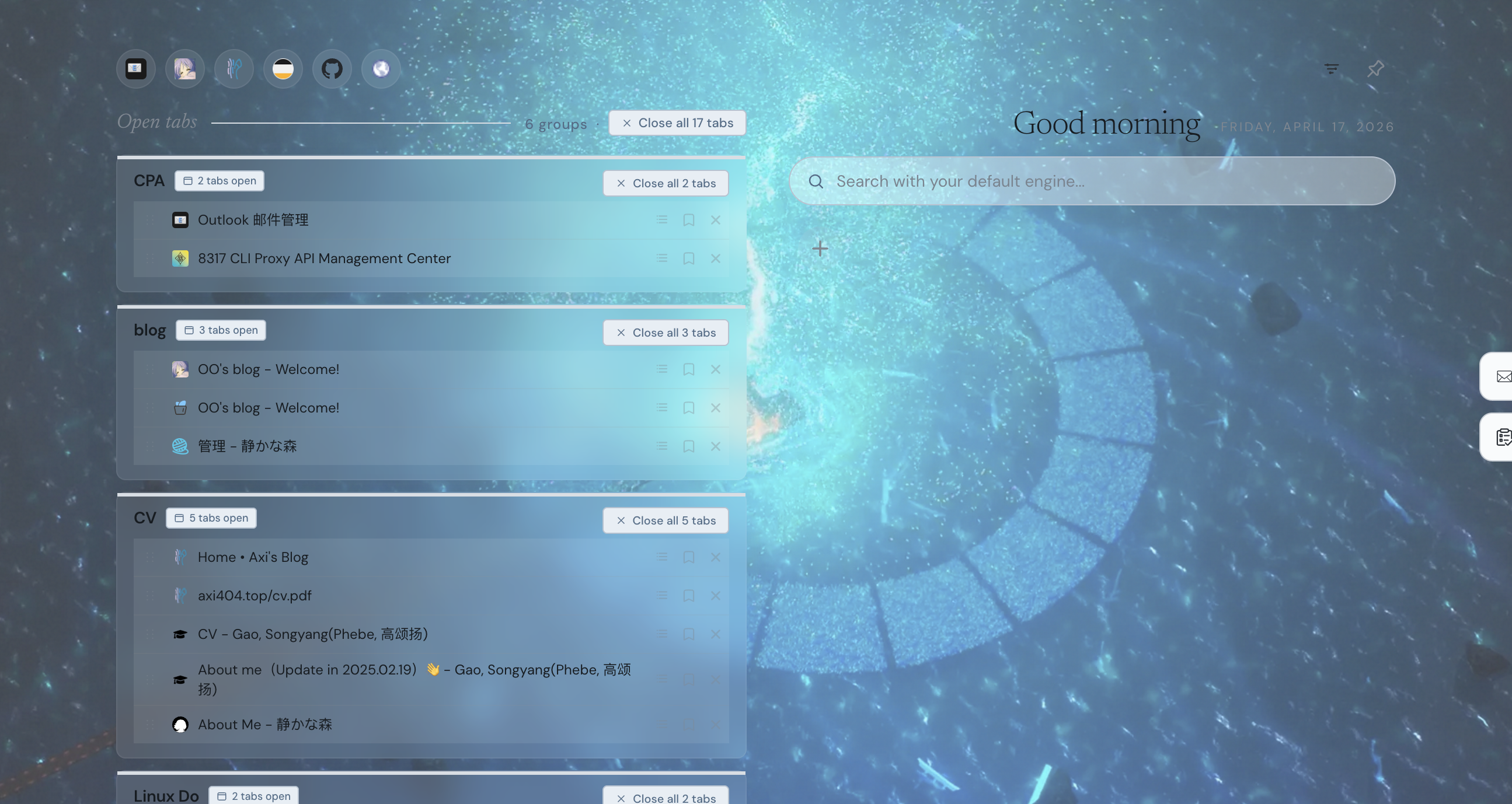
First, tabs are automatically organized by domain: The original "long, unclear strip of tabs" at the top of the browser here becomes a structure more like workspaces. Things like GitHub, documentation, forums, and search results naturally fall into different areas. Homepage-type pages are also placed separately into a Homepages group, so they don't get mixed up with the content you're actually working on.
If automatic grouping isn't enough, you can also manually create groups: This is quite important for me personally because sometimes workflows aren't divided by website, but by task. For example, during a release process, you might have GitHub, documentation, asset pages, and forum posts open simultaneously. That kind of situation is more suitable for grouping manually.
Another feature I find quite handy now is quick navigation via top icons: When you have many tabs, the problem isn't necessarily a lack of categorization, but that "jumping between them is slow." Although the top icons feature is small, it's quite useful for frequently switching back and forth between several workspaces.
Another thing I've always wanted but rarely see in new tab pages is a read-later drawer: Some pages you don't want to look at now, but you also don't want to close them and forget about them completely. These are perfect for tucking away in the drawer. This way, the top of the browser won't be cluttered with a bunch of "read later" pages, but these things aren't lost either. You can search for them, restore them, or archive them later.
I also conveniently added lightweight to-do functionality: It's not meant to replace formal task management software, but for small pieces of information like "I'll just note this down now" or "I'll handle this later," keeping them right next to your current workspace is usually much more convenient than opening another tool.
There are also some more practical but less prominent small features, like Quick Links, one-click cleanup of duplicate tabs, theme switching / transparency / custom background, and so on. Individually, they aren't major features, but when put together, the entire new tab page feels more like your own browser workstation, rather than a default blank page.
Demo
Motivation & Installation
Why did I want to make this? Ultimately, it's because my own browser habits are quite chaotic. Researching, coding, checking issues, browsing documentation, reading forum posts, jotting down notes—these states often get mixed together. Tab Harbor is essentially my own answer to this problem.
It's still a very lightweight project, running entirely locally. There's no backend, no account system; all data is stored in chrome.storage.local.
The installation method is also straightforward. After cloning the repository, go to chrome://extensions, enable Developer Mode, then click "Load unpacked" and select the extension/ folder.
I'd also like to mention in passing that this project is based on Zara's open-source project tab-out: https://github.com/zarazhangrui/tab-out
Everyone is welcome to try it out and give feedback! Also, I'd appreciate a star.